A study of Transitional Typography
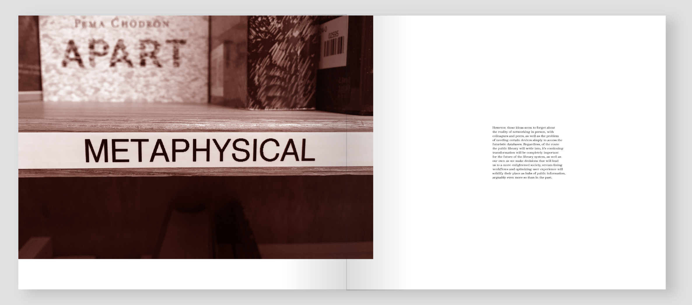
This project centered around a typographic system devoid of branding—type that has a certain aesthetic based on its history and usage, not its target audience.
So much was learned in the compiling of this project. It functioned as a research paper turned into a publication, with all original photography and copy by the designer (me). The level of personal engagement and journalistic detective work required to find evidence of the transition from stamping to typing was certainly not minimal, but thoroughly enjoyed. Who needs a reason to mosey around the library?


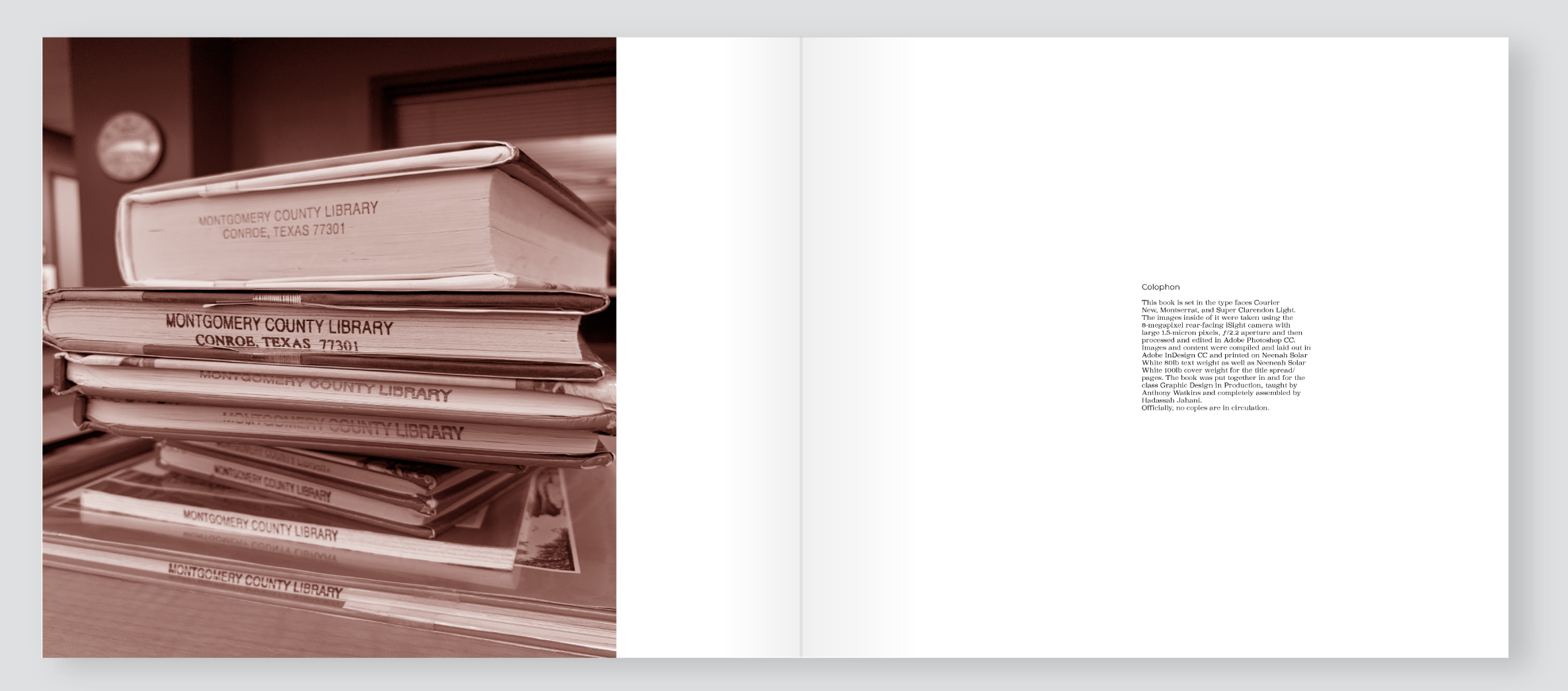


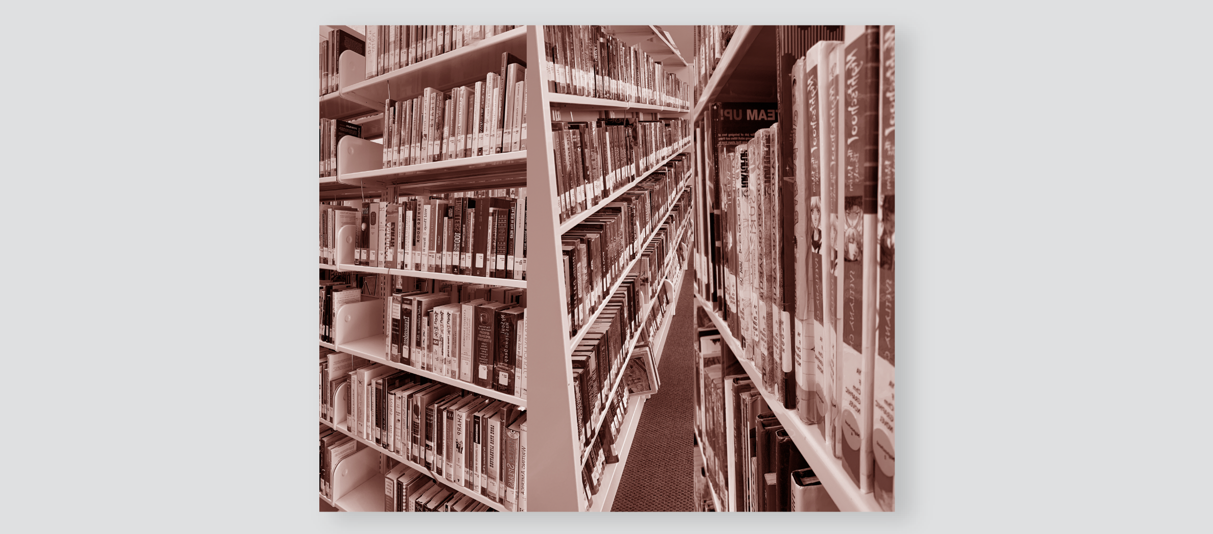
Original Photography